이번 글은 이전 글의 코드를 이어서 진행하겠다.
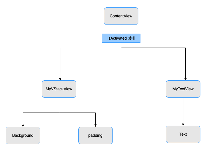
@Binding을 이용해서 다른 View에서도 데이터를 연동할 수 있도록 해보자.
1. @Binding을 사용하고 다른 View에서 해당 변수를 사용해야하기 때문에 Private를 쓰지 않고 변수를 선언하자.
//MARK: 데이터를 연동
    @Binding
    var isActivated: Bool
2. init을 사용해서 기본값을 설정해주자.
//MARK: 생성자 - 기본값 설정과정
    init(isActivated: Binding<Bool> = .constant(true)) {
        _isActivated = isActivated
    }
3. Bool 값에 따라서 속성을 변경해보자.
import SwiftUI

struct MyVStackView: View {

    //MARK: 데이터를 연동
    @Binding
    var isActivated: Bool

    //MARK: 생성자 - 기본값 설정과정
    init(isActivated: Binding<Bool> = .constant(true)) {
        _isActivated = isActivated
    }

    var body: some View {
        VStack {
            Text("1!")
                .fontWeight(.bold)
                .font(.system(size: 30))
            Text("2!")
                .fontWeight(.bold)
                .font(.system(size: 30))
            Text("3!")
                .fontWeight(.bold)
                .font(.system(size: 30))
        }

        .background(self.isActivated ? Color.blue : Color.green)
        .padding(self.isActivated ? 10 : 0)

    }
}
4. MyVStackView에서의 isActivated 상태와 ContentView의 isActivated 상태를 연결해준다.
연결하는 방법은 $을 붙여준다. (코드 참고)
import SwiftUI

struct ContentView: View {

    @State // 값의 변화를 감지
    private var isActivated: Bool = false

    var body: some View {

        NavigationView {
            VStack {
                HStack {

                    MyVStackView(isActivated: $isActivated) //데이터 연결
                    MyVStackView(isActivated: $isActivated) //데이터 연결
                    MyVStackView(isActivated: $isActivated) //데이터 연결


                }
                .padding(isActivated ? 30 : 10)
                .background(isActivated ? Color.red : Color.yellow)
                .onTapGesture {
                    print("탭 했습니다.")
                    //애니메이션
                    withAnimation(){
                        //toggle() - true이면 false로 false이면 true로 상태를 변경
                        self.isActivated.toggle()
                    }


                } // HStack

                //네비게이션 버튼(링크)
                NavigationLink(destination: MyTextView()) {
                    Text("Go Navi")
                        .fontWeight(.heavy) //폰트 굵기
                        .font(.system(size: 30)) //폰트 크기
                        .padding() //패딩
                        .background(Color.gray) //백그라운드 색상
                        .foregroundColor(Color.cyan) //텍스트 색상
                        .cornerRadius(30) //버튼의 각을 둥글게(30정도)
                }.padding(.top, 50)

            } // VStack
        } // NavigationView


    }
}
한마디로 ContentView에서의 isActivated의 상태를 MyVStackView에서의 isActivated에 넣어주는 것이다.
5. MyTextView에서의 isActivated 상태와 ContentView의 isActivated 상태를 연결해준다.
import SwiftUI

struct MyTextView: View {

    //MARK: 데이터를 연동
    @Binding
    var isActivated: Bool

    //MARK: 생성자 - 기본값 설정과정
    init(isActivated: Binding<Bool> = .constant(false)) {
        _isActivated = isActivated
    }


    @State
    private var index: Int = 0

    private let backgroundColorArray = [
        Color.red,
        Color.yellow,
        Color.blue,
        Color.green
    ]

    var body: some View {
        VStack{
            //MARK: Spacer - 다른 object의 크기가 변하지 않는 선에서 본인의 크기를 최대한으로 늘리는 성질을 갖고 있음

            //따라서 Spacer를 위아래로 주게되면 위아래로 최대한 Text를 늘린다.
            Spacer()
            Text("배경 아이템 인덱스 \(self.index)")
                .font(.system(size: 30))
                .fontWeight(.bold)
                .frame(minWidth: 0, maxWidth: .infinity, minHeight: 0, maxHeight: .infinity)
            // 양옆으로 배경 꽉채우기
            Text("isActivated: \(String(isActivated))")
                .font(.system(size: 30))
                .fontWeight(.bold)
                .foregroundColor(self.isActivated ? Color.yellow : Color.gray)
                .background(Color.green)
            Spacer()

        }
        .background(backgroundColorArray[index])
        .onTapGesture {
            // 한번의 탭이 될때 마다 index를 +1 해준다.
            self.index += 1
            // index의 갯수는 4개이기 때문에 index를 4로 나눈 나머지를 index로 넣어준다. - 인덱스 오류 방지
            self.index = self.index % 4
        }
    }
}

struct Previews_MyTextView: PreviewProvider {
    static var previews: some View {
        MyTextView()
    }
}
추가적으로 "isActivated: 상태" 텍스트의 위치를 위쪽으로 옮겨주려면 frame의 maxHeight를 조정해주면 된다.
마지막으로 ContentView에 가서 MyTextView(isActivated: $isActivated)로 수정해주면 된다
import SwiftUI

struct ContentView: View {

    @State // 값의 변화를 감지
    private var isActivated: Bool = false

    var body: some View {

        NavigationView {
            VStack {
                HStack {

                    MyVStackView(isActivated: $isActivated) //데이터 연결
                    MyVStackView(isActivated: $isActivated) //데이터 연결
                    MyVStackView(isActivated: $isActivated) //데이터 연결


                }
                .padding(isActivated ? 50 : 10)
                .background(isActivated ? Color.red : Color.yellow)
                .onTapGesture {
                    print("탭 했습니다.")
                    //애니메이션
                    withAnimation(){
                        //toggle() - true이면 false로 false이면 true로 상태를 변경
                        self.isActivated.toggle()
                    }


                } // HStack

                //네비게이션 버튼(링크)
                NavigationLink(destination: MyTextView(isActivated: $isActivated)) {
                    Text("Go Navi")
                        .fontWeight(.heavy) //폰트 굵기
                        .font(.system(size: 30)) //폰트 크기
                        .padding() //패딩
                        .background(Color.gray) //백그라운드 색상
                        .foregroundColor(Color.cyan) //텍스트 색상
                        .cornerRadius(30) //버튼의 각을 둥글게(30정도)
                }.padding(.top, 50)

            } // VStack
        } // NavigationView


    }
}


struct ContentView_Previews: PreviewProvider {
    static var previews: some View {
        ContentView()
    }
}
'iOS - 실무관련 > SwiftUI' 카테고리의 다른 글
| Set Image (0) | 2022.07.15 |
|---|---|
| Text (0) | 2022.07.14 |
| 웹뷰 띄우기 (0) | 2022.07.13 |
| @State - 상태변화 감지 (0) | 2022.07.12 |
| SwiftUI와 친해지기 (0) | 2022.07.12 |


